Graphic design is about communication. You want to send the right message to your targeted audience and display what’s special about your brand. Let’s walk through the key graphic design elements that you should be using to create ads that stand out.

Typography
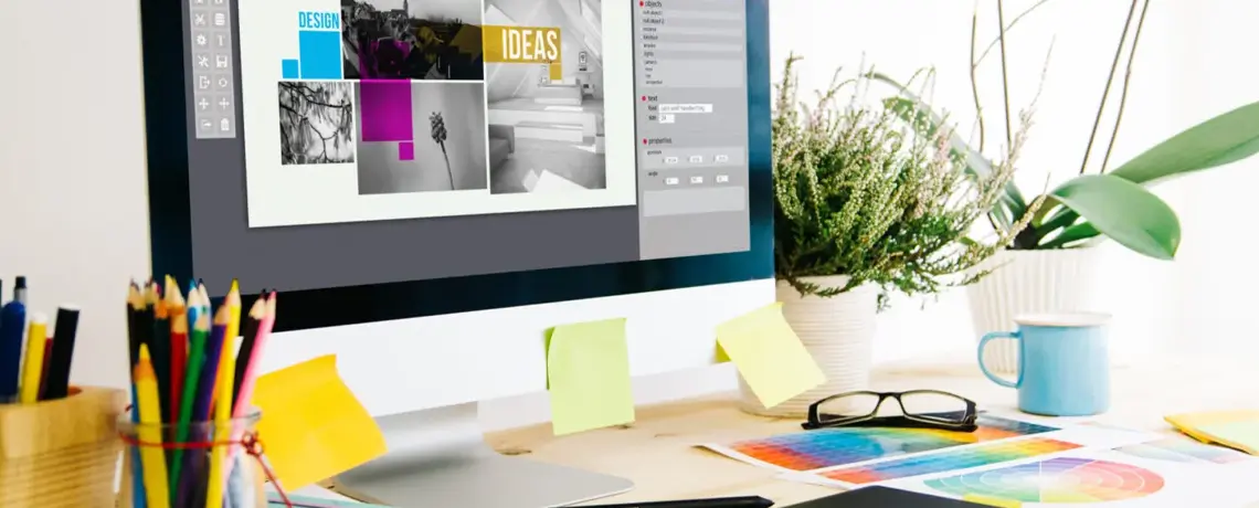
In graphic design, typography is how you arrange text within your advertising. This also includes texts fonts and whether the text is highlighted, bolded, or italicizing phrases to create attraction to them. Consider how you put words together on the screen. Play around with different text positions to ensure your ad is well-balanced.
Visuals
Visuals take up the majority of the space on your ad. They are necessary to utilize for conveying messages and describing services and products. This can be things like:
- Illustrations
- Images
- Videos
- Logos
- Graphs
- Pie charts
Utilizing visuals can help when it’s hard to put your message into words or to reinforce your written message. It’s another chance at building trust and brings you closer to your audience.
Space
Learning the art of space is key to mastering how to craft well-balanced ads. Space in graphic design is the space surrounding all elements like text, shapes, or visuals. This can also be called “White space” or “negative” space. This element is important because if there is not enough clear space, your design might look cluttered, and difficult for your audience to understand. On the flip side, if you have too much space, your ad might seem hollow and uninteresting.
Color
Picking the color schemes for your campaigns is by far one of the most important elements. Whether you chose to go with a bright, vibrant palette or muted tones, the colors you decide to use affect the whole mood of your campaign. Consider using color wheel rules to get you started:
- Complementary colors: Sit on the opposite side of each other, like red and green
- Monochromatic colors: Different shades of one color, such as different hues of blue.
- Analogous colors: Sit right next to each other
- Triadic colors: Evenly spaced out across the color wheel like yellow, red, and blue

You can play around with color combinations until you find the one that feels right, but don’t forget to consider the colors from all visual elements. This means background color, text color, and colors from logos or images. You want to create a cohesive color scheme that brings emotion and design together.
Lines and Shapes
Lines have quite a few creative functions, such as:
- Organizing information in a fascinating way
- Establishing a tone or mood
- Building a sense of flow and energy
Lines are highly expressive means that can be:
- Curved
- Straight
- Solid
- Dotted
- Thick
- Thin
Shapes in graphic design are the forms, contained within lines, such as squares, rectangles, and circles. There are two types of shapes: organic and geometric. Organic shapes are less well-defined. This includes natural shapes like flowers and irregular or curved shapes. On the other hand, geometric shapes are more simplistic. These are your basic 2D or 3D shapes like triangles and spheres. You can use a blend of both organic and geometric shapes or stick to one for a uniform look.
The key takeaway? Graphic design helps you create content that attracts attention and sticks in a consumer’s mind, long after the design disappears. However, if you find that graphic design is not for you, our team of designers at Hometown Marketing Group can help you include the perfect elements in your campaign to make it irresistible to your target audience.